
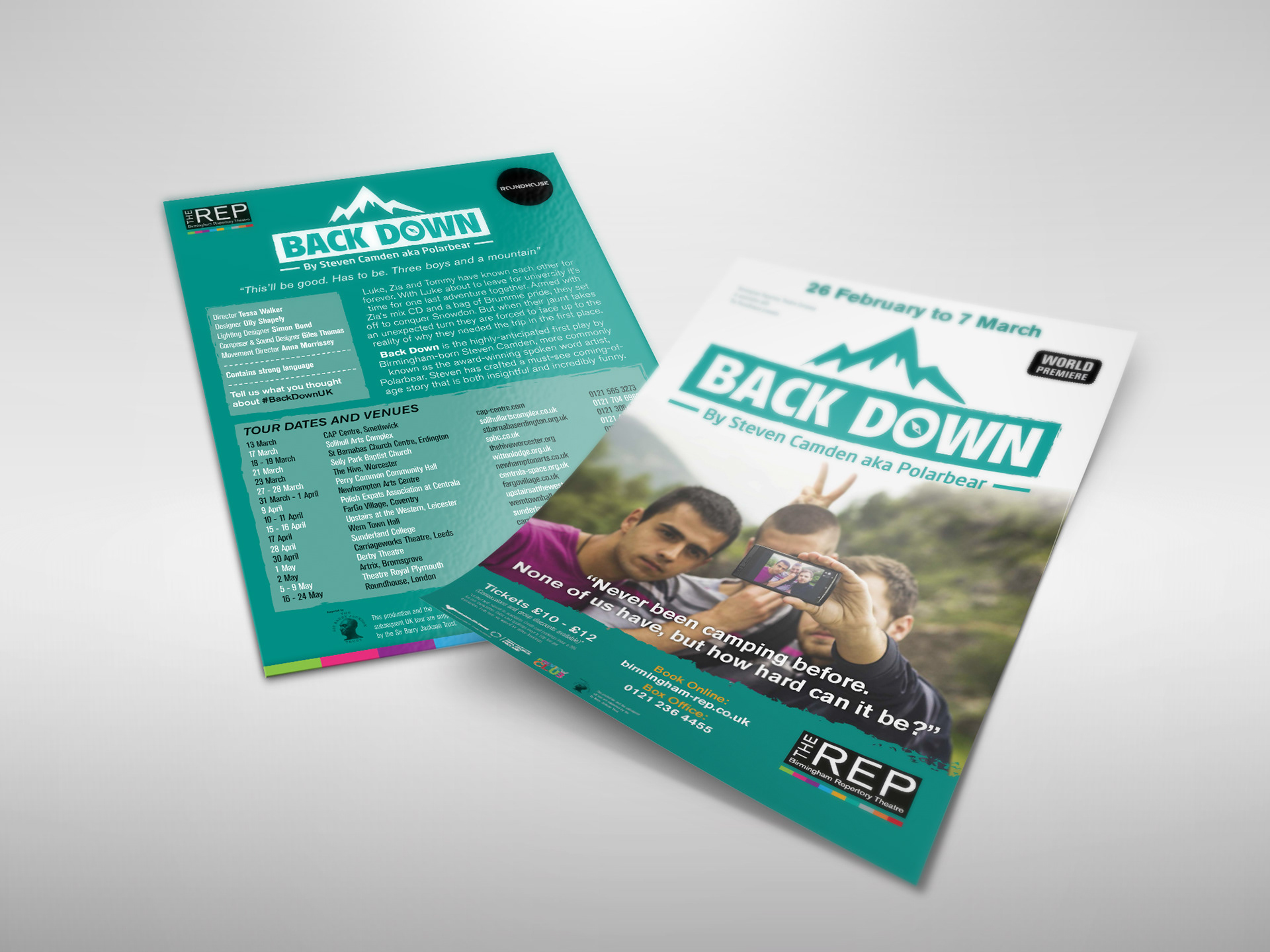
The centre of the print campaign was a promotional flyer. This no frills slightly rough style was designed to reflect the young cast, to target the younger audience with bold simple colours and simply get across the paired down more realistic performance the audience could expect to see. 2 versions of the flyer were created for the show run at the REP and the full uk tour.

Online assets for the show were created including, web headers, adverts for listings pages and various digital ads.
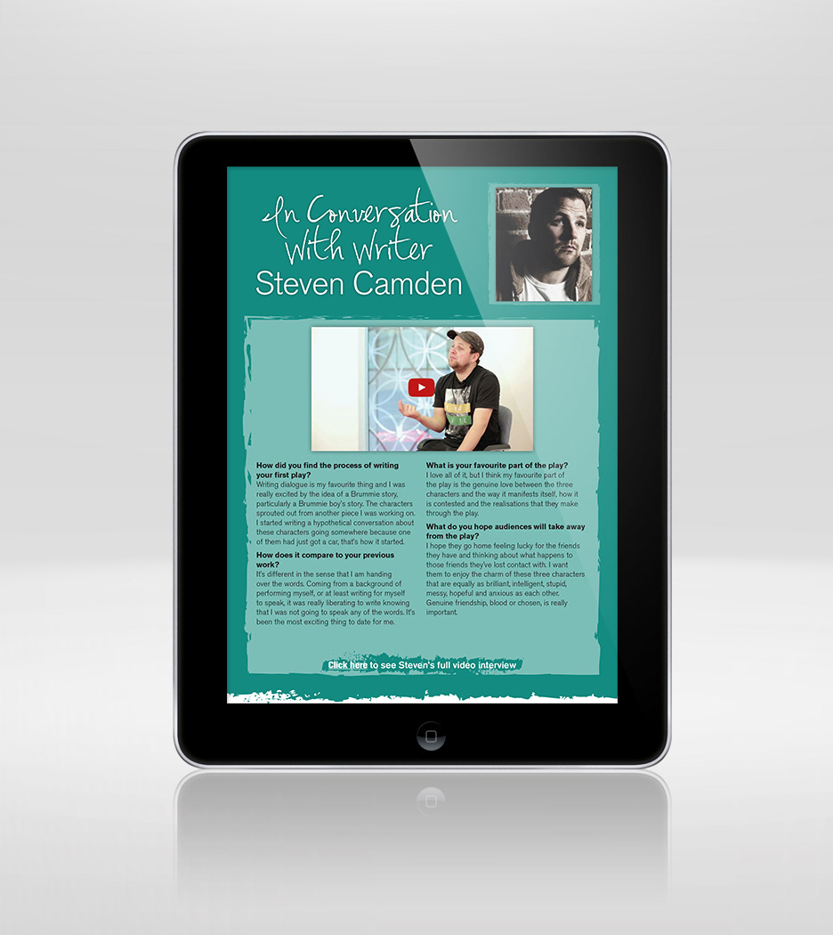
A 12 page interactive programme was designed to be viewed in advance of the show. Following the style established for the literature it contained interviews and links to video interviews with the writer and director, plus cast photo's and biographies, as well as rehearsal photography. All designed by Headtapes Creative.